Is Your Design Killing Your Website?

This is a guest post written by Wade McMaster. Wade is a professional graphic and website designer who started the website Design Web Identity, a blog about starting and growing websites. He writes tutorials and informative posts on design, social media, traffic and finding your voice. Check out his website for more information!
More and more content.
Constantly you pump out more blog posts, share more links on Facebook, share your website on social bookmarking sites and other top places. Your search engine traffic has slowly grown, you’re getting visitors, things are getting busy but still no leads, no subscribers.
Damn, that’s annoying.
The website isn’t working! It’s not converting and you’ve been wasting your time! ….right?
It’s possible, but if you’ve got good content and people really are showing up on your website and nothing is happening – all the advice in the world seems to be failing you.
NOTE: Be sure to grab the free download Quick Fixes Checklist with Easy Ways To Improve Your Website after reading this article at the bottom of the page.
Don’t worry I have a quick trick which could possibly fix all that!
It’s called, “fix your crappy design“!
Look I don’t want to offend, you may think your website design is pretty good, you picked it / designed it yourself! I am being dead serious here, it doesn’t look that bad. But how well does it function?
Are you absolutely certain that people are arriving and seeing your content quickly and easily with no effort? Do you have somewhere for them to go after they’ve read your epic content? Or do they simply glance around, think “that was interesting” and head back to never ending web of blogs on the information super highway?
There are a few things I need you to think about, review on your site and possibly even change.
Just remember, a poor website design is like talking to a auditorium full of people quietly with no microphone. It’ll take a too much effort for people to listen so chances are they’ll turn around and leave.
Give yourself that microphone.
Let’s take a look!
Ok, head on over to QuickSprout.com and enter your website address in to the text field and click ‘Search’. Let’s see how quickly your website loads on their panel.
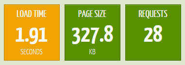
Was it faster than 3 seconds?
If it was then you did well, if it wasn’t then you may need to look at speeding things up. Most people won’t wait more than a few seconds for a page to load. So effectively your design could be responsible for a massive amount of failed visits.
Simplify and make your design a bit more light weight:
- Try slimming down the amount of plugins you use as they’ll create more information to load, and drastically slow down your website.
- Optimize your images and make them smaller, so they load faster!
- Reduce the amount of social media boxes and buttons on your page (prioritize this one)- stick with the essentials – your website wont get shared if it never loads in time!
- Use Caching plugins – I use W3 Total Cache in WordPress, something similar on other platforms would be an asset to your website.
Do anything you can to get the page size down, the file requests down and get under 3 seconds. Under 2 is preferable.
Next, What’s above the Fold?
Your website loads quickly, now more people will see what you offer when they visit. So what’s the first thing they see?
We’re concerned with whats above ‘the fold’, which is anything on the page before your users scroll down. People want something in particular when they arrive on your site, get that something up and right in front of them.
This means blog posts should feature prominently above the fold as the main focus. A product on an E-Commerce site should be the first thing people see. Showing off a video? notice how YouTube, the largest video site in the world, has a small logo and search field at the top but a massive video section that fills up most of the page. You guessed it, it’s above the fold and easy to find!
Follow that example, pop the main focus of the page right in front of the user.
So now you website loads quickly, people can find what they’re after instantly – convenience is key…
…but do people trust you or your website?
Clutter kills trust. Without trust and a good first impression, people bounce and ignore your content.
Two cluttered sidebars, countless ads, annoying popups, low resolution images, flashing animated gifs, music playing the background, etc, etc – all of these things and more are annoying, make you look cheap, scammy or even inexperienced in your niche.
It’s the lack of a professional image which will destroy trust.
Keep the design clean, have a logo, if you’re a personality – include a picture of yourself and make sure your layout only contains what’s important so it’s simplified and uncluttered. This will bring your design to the final level.
When people see a logo they see work, effort and money spent behind a website. When they see a photo of a writer or a team of people creating what the website delivers it puts a sense of personality and accountability behind your website. Even a picture of a building (if you operate out of a premises) relaxes people’s minds because they know they can drop in and sort things out face to face if needs be.
Finally when things are simple and clean, your image is polished off then you look like you’re serious.
When you see a professionally designed website with these attributes you know it has been taken seriously, money has been spent on it and you can contact these people directly – what’s not to trust about that?
Now, you’re ready to accept visitors to your website.
This is not the one solution, any failure to bring people to a website could be a number of things – but this is the very first place I would start before trying to market your website. The only other thing you need to do is make sure you add a call to action to your site – subscribe, buy, Like, Follow etc.
If you run a blog, at the end of each post you should direct them to a this action. Put it on the sidebar and mention in occasionally in your text. Of course if you run an e-commerce site putting that ‘Add to Cart’ button somewhere easy to find is a must.
Remember, a website can serve a purpose and if you’re spending money on it then it really should.
So take a look, review and revise and see where you could improve your website!
If you found these tips helpful, keep checking back with me on Design Web Identity (maybe even subscribe to my newsletter? There’s a Free E-Course on building a website with it!) for more free tips and info.
…and definitely keep checking back with Gedaly here at Awesome Web Guy. Thanks for reading!